online presence

6 articles tagged as online presence

Photo from Raider of Gin's photostream http://www.flickr.com/photos/fairerdingo/

I read a great blog post today about author platform and when/how to focus on building one. In short, publisher Rachelle Gardner said to stop trying to build your brand.

As writers, it is sometimes easy to tell ourselves that we are being productive when we blog and tweet and facebook. But are we really being productive? Or are we just procrastinating?

According to Gardner in her post Novelists: Stop Trying to Brand Yourself, an unpublished/unrepresented author should be focusing more on the actual craft of writing. Sure, writing blog posts and tweets helps with this to a degree, but what good is it if you have nothing to show your audience? And then we come to who your blog/twitter/facebook audience is. Are you writing these things for your future readers, or are you focusing more on attracting other writers/professionals in the industry?

Gardner stresses the importance of focusing on who you are writing books for. Industry professionals play into this, but the most successful writer blogs I’ve seen are the ones that focus more on the reader. And if you are writing to your reader, then it’s not procrastination. You are honing in on your voice while also attracting an audience.

How can an unpublished writer take their blog from industry focused to reader focused? How have you made your blog more reader friendly?

Yesterday morning I was heading to work on the T (the subway, for all you non-Bostonians), reading the Metro and I saw a story about Jeff Kinney. I am sure you can imagine my surprise and joy. To see a writer of kids’ books featured in the subway paper that usually displays stories about corrupt politicians, murders, and the Boston Red Sox made me feel like kidlit is truly on the rise.

The story was not long, but what it lacked in stature, it made up for in impact. The article looked at Jeff Kinney’s career, at the struggles he had trying to make it as an illustrator. It also looked at the struggles he still has. And I found it inspiring.

Jeff Kinney did what many author’s today are doing. He turned to electronic media, in his case a website, to pave his way, to create his own audience. And it paid off.

But what I also liked was that Jeff Kinney admitted that writing is hard. So often I hear stories of the writers who can complete a book in a few months. While this is encouraging, it can also become frustrating since I’m not yet at that level. To read that it takes him 9 months and that he doesn’t always find it easy to come up with his jokes was refreshing.

As an author, how are you paving your way? Do you have any special tricks? If you’re still trying to find your way, try checking out this article, 17 Ways for Writers to Publish their Content for some ideas. And which do you find more inspiring: authors who can crank out content or authors who are a bit slower?

One thing that has been bothering me while trying to redesign my site is audience. Who is my site intended for? Future fans? Other writers? Agents and Publishers?

The Elements of Web Design

In designing a site, there are two things you need to consider: function and audience. We covered function in the last post, but here’s a recap since it’s been a while. The point/function of the site is to create an online presence that should be professional while also showing my personality as a writer. Ideally it will be something I can build off of once I am a published writer.
So what about audience? Since the main feature of my site right now is my blog, that would suggest that my main audience is other writers and maybe (one can hope) agents and publishers. But I don’t want to design a site that will become obsolete once I have something ready to submit and then ready to publish. So I would like to create a site that is also accessible to agents, publishers, and future fans.

Mock-ups: The Building Block of a Successful Design

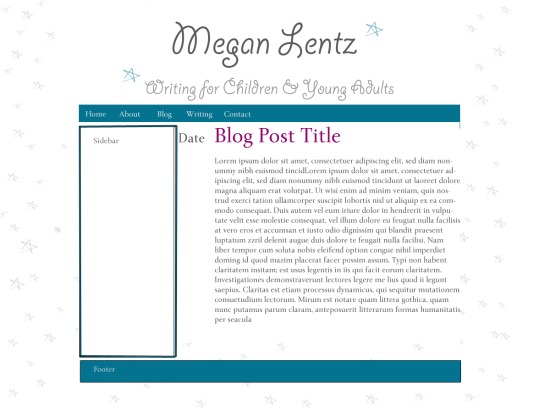
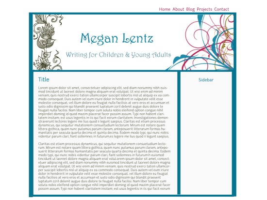
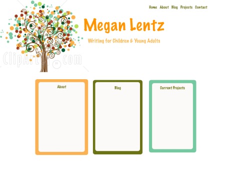
In thinking about the audience, I have come up with some mock-ups, or sample designs. To create these, I used Photoshop and made a sample web page. The purpose of a mock-up is to provide a sense of what the site would look like – how the colors and images and layout will all work together. Creating a mock-up saves time and gives you samples to run by other people. In this case, I decided to share my mock-ups with my current audience (yes, that would be you) and see what you think. Let me know which is your favorite or if you hate them all. If you do hate them all or if something bothers you about any of them, please let me know. I won’t be offended and you will reap the benefits by getting to visiting a site that is aesthetically pleasing.

Mock-up 1

This Mock-up uses the blog as the home page. The stars and font add a playful, whimsical element to the website.

Mock-up 2

The second Mock-up aims for a more professional, but still fun feel. The colors are a bit more serious and the graphics are a bit more mature.

Mock-up 3

The final mock-up uses a true Home page. I haven't decided if the boxes will contain text excerpts from the pages or graphics or a combination.

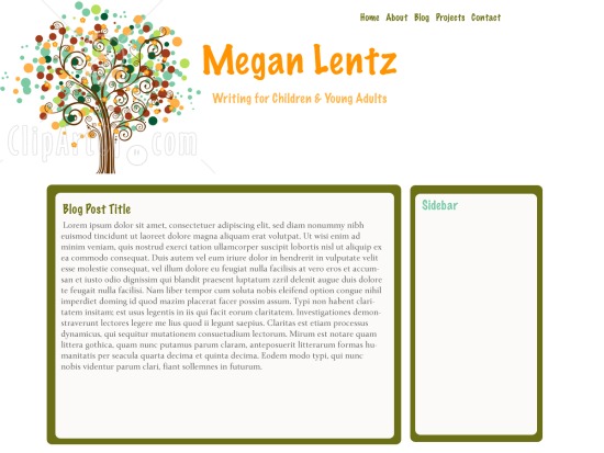
And here's an example of the blog. The other pages would incorporate the color from their home page blocks.

As some of you may know, I’m taking a web design class this semester. It’s something I’ve been interested in for a while and I figured, as an added bonus, it would help me to create a professional, user-friendly website.

This series will span over the next couple of months, with a post here and there. At the end of the series, I will have a brand spanking new site up and running and ready for your viewing pleasure. So let’s begin.

Creating an Author Website

As I start thinking about redesigning my site, I find that I have to start at the beginning. Specifically, the building blocks of a great author website. Lucky for me, there was a post on Inky Fresh Press yesterday about cleaning up your online presence. Not only did the author, Brigid, offer great suggestions, but she also included links to several helpful articles.

The main points I got from these sources were:

  • Keep your site professional – both in design and content.
  • Let people know who you are – include a head shot and a short bio
  • Keep the content clean and easy-to-read
  • Use a memorable url, preferably your name – an author website is like your online business card
  • Include a way for people to contact you
  • And, most importantly, be professional

Some additional points I picked up about content are to include:

  • Bio page
  • Blog
  • Writing Excerpts/publications
  • Contact Page

An Author Website for the Unpublished

I found Annette Fix’s article, What Every Website Needs, to be the extremely helpful when addressing this issue. Not only does she tell you the elements you must have, but she also gives some guidelines for what to include in each section.

The main difference between a published author’s website and an unpublished author’s is that the published author needs to include information about their books and should have a separate website devoted to each title/series. Unpublished authors, of course, do not need to do this since they are unpublished. Otherwise, the sites should be more or less the same.

My Layout

Before I can start designing my website, I need to figure out the layout, or the site architecture. I’ve decided to include the following pages:

  • Home
  • About
  • Blog
  • Projects
  • Contact

The Projects page can include writing samples but it is also versatile because I can use it in the future for published works, works that are with an agent/looking for an agent, sample chapters, etc. I already have a bio page on my current site, I’ve been maintaining a blog, so I can just move that content over, and a contact page is easy to create using widgets or some simple coding. All that leaves me to create content for are the writing projects page (which I sort of already have for my writing samples) and a home page. Because I am not yet published, I will either use my home page as a landing page or just have it redirect to the blog.

What this means is there will really be little content to create. The bulk of the work will revolve around creating a clean, professional, personable design.

Coming Up…

Stay tuned next week for Website Redesign Part 2 – Part 2 will look at some mock-ups for my redesigned site.

As a follow-up to my post earlier this week, Calling all 9-12 year Olds, I found out about this great resource for authors and teachers called Skype an Author Network. The service allows authors to connect with teachers/readers to arrange author visits via Skype. Low income schools can use this service to bring authors into their classrooms without having to pay huge fees (and, depending on the duration of the chat and the author’s policy, the presentations are often free). Authors also benefit because they can make lots of visits without worrying about travel time or the limited budgets publishing houses have for book tours.

To learn more about this program, check out Kate Messner’s article from the School Library Journal, An author in Every Classroom: Kids Connecting with Authors via Skype. It’s the next best thing to being there.

I’m not quite sure why, but the thought of creating an online platform to draw in MG/child readers seems a bit strange to me. I think about when I was a kid and had to pay for Internet usage by the minute. If I was looking for a new book, I asked the school librarian or perused the shelves at my local bookstore. But oh, how the times do change.

In thinking about younger siblings of my friends, they were extremely active online, joining writing communities and list serves and engaging in online role playing games from 8th grade up. And this was 10+years ago. With the advances in technology and publishers such as Simon & Schuster launching online books (see my post from July 30), why wouldn’t you be able to build an online platform for children, middle grade readers, or young adults? Who knows, it may even be easier to capture these age groups online than it is to capture the 40+ readers who did not grow up surrounded by constant access to the Internet and technology.